UX/UI Case study
Prentus
Dashboard and Onboarding Design for a jobs search platform specializing in career changers and the tech industry
OVERVIEW
Prentus is an “all-in-one job search platform that connects career changers, boot camp grads, and entry-level talents to employers in the tech field.
At the time of this project, Prentus had recently launched its employer marketplace, where companies can sign up and partner with schools and other talent communities, such as tech boot camps or professional organizations, to access their talent pool.
THE CHALLENGE
Onboarding: Employers new to Prentus were experiencing confusion getting started on the platform. They would get through the sign-up process and not know what to do next. Our challenge was reimagining the onboarding process and the dashboard to create a clear and positive user experience.
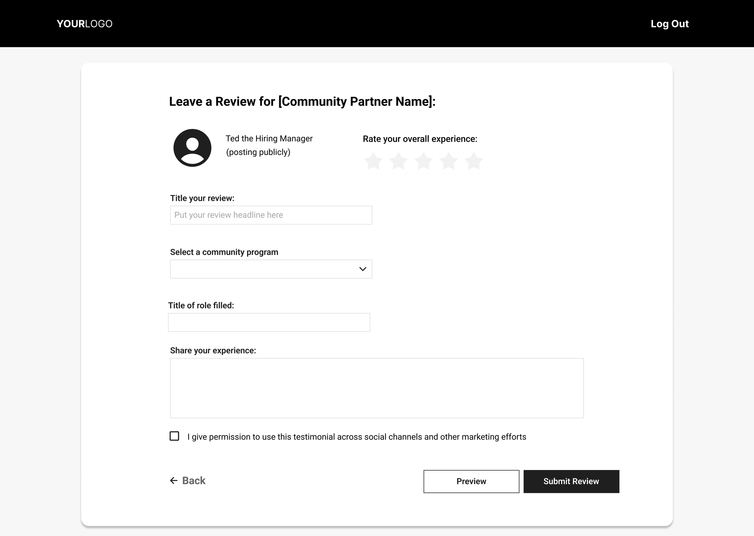
Reviews: Our team was prompted to create a user flow for communities to request reviews from employers they have partnered with.
MY ROLE
UX Researcher, UX/UI Designer
TEAM
Grace Curley
Kim Dirmaier
Kirstin Nielsen
Neelu Mirkhani
SCOPE
4 Weeks
TOOLS
Figma
Google Suit
Zoom
Otter.ai
Canva
Calendly
Bubble
ClickUp
PROTOTYPE

Process
Empathize
Stakeholder Interview
Heuristic Evaluation
Competitive Feature Analysis
Moscow Matrix
Usability Testing
Define
Problem Statement
User Archetypes
User Journey Maps
Ideate
Brainstorm
Task Flows
Affinity maps
Design
Sketches
Wireframes
Mockups
Test
Usability Testing
Research
At this preliminary stage, we focused on building an understanding of the business, the market, and, most importantly, the users.
Our team lacked clarity on what our users wanted, needed, and expected. We began our research process with the following questions in mind.
Who are Prentus's users?
What are their expectations of a job search platform?
What points of confusion do they encounter with the Prentus?
To answer these questions, we employed various methods, including a heuristic evaluation, a competitive feature analysis, a Moscow matrix, and a series of usability testing.
Heuristic Evaluation
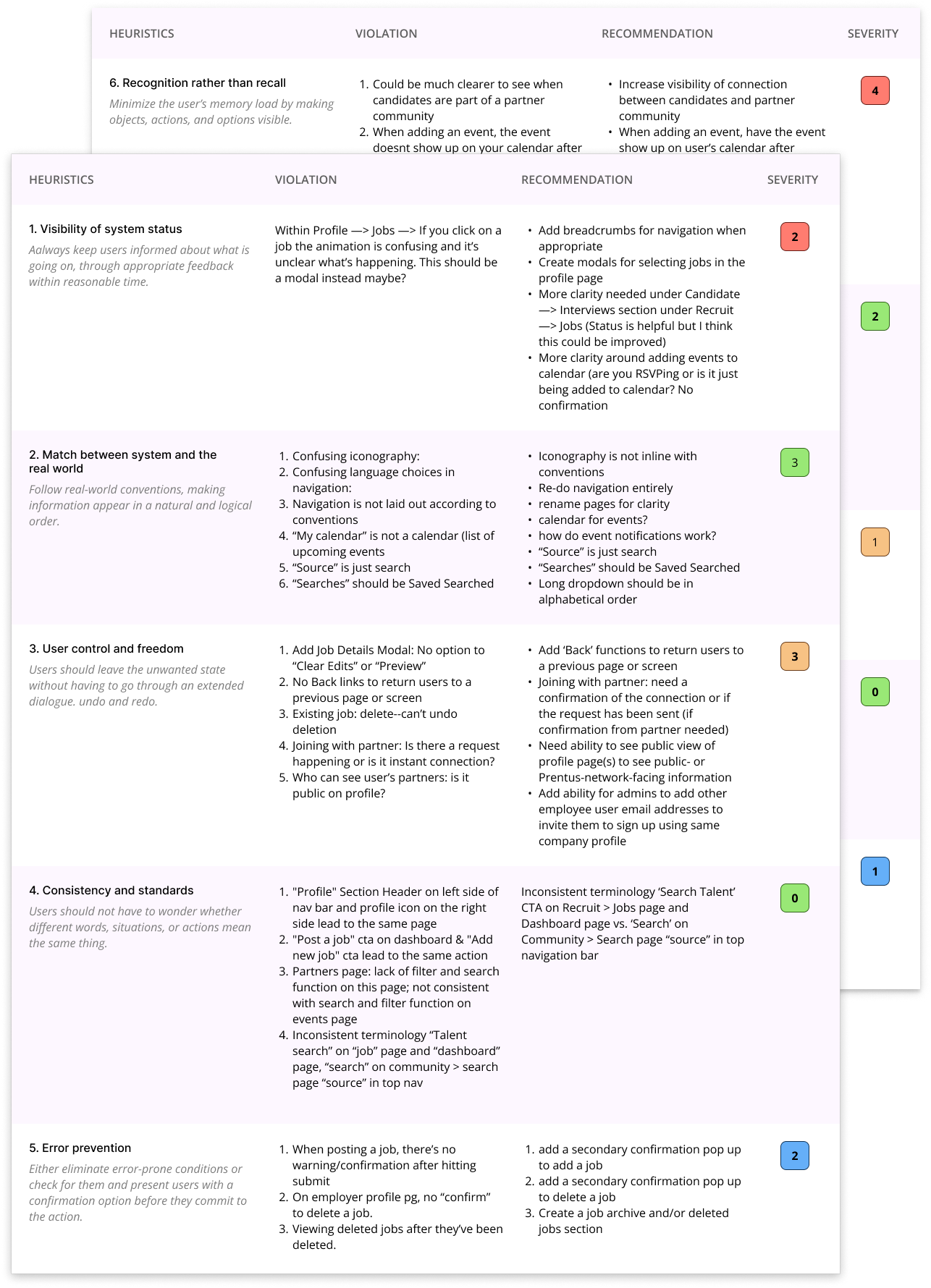
Before doing anything else, our team needed to understand how the existing Prentus product functioned. We conducted a heuristic evaluation, and our goal was to determine how usable the platform was and identify specific areas to focus on moving forward in the project.
Observations:
Inconsistent use of language: The site was not easily learnable due to vague, unfamiliar, inconsistent language and unclear calls to action.
Counterintuitive navigation: A lack of navigation elements, such as breadcrumbs, made it difficult for the user to know where they are on the site.
Unorganized: Related content was frequently unorganized and divided into separate pages making it difficult to navigate and unclear how to take the next step in a process.
Recommendations:
Intuitive primary and secondary navigation
Familiar and consistent language
Consolidated pages that contain related content
Visibility of valuable content
Competitive Feature Analysis
Because this project had two focus areas, we reviewed competitors with two types of products that paralleled the functionality of Prentus. Our team looked at the onboarding process for three recruiting/hiring platforms and three competitors related to reviews and testimonials.
These are the features and functionality we observed across all competitor and comparator sites:
Sign-up page
Guided onboarding walkthrough
Welcome landing pages
Dashboard navigation and components
Side and top navigation
Review sections with quantitative and qualitative reviewing styles
Review solicitation and confirmation systems
Onboarding
Reviews
User Interview
In order to better understand the Prentus user base, we scheduled a series of 15-minute interviews with professionals who had experience with the hiring process. To accomplish this, our team developed an interview protocol consisting of questions designed to tell us about the participant’s experiences, needs, and expectations regarding recruiting platforms.
Question included:
How familiar are you with Prentus?
How often do you hire boot camp graduates?
What online hiring platforms have you used before?
What are your goals when you are using a hiring platform?
How would you characterize your experience using hiring platforms?
Usability Testing
To better understand what was and wasn’t working with the current Prentus product from a user perspective, we also conducted an initial round of usability tests using a prototype of the Prentus recreated in Figma.
The participants were given multiple scenarios and asked to complete a task.
Scenario 1: You're a hiring manager and your company has decided to join the Prentus network.
Task: Sign up on the Prentus website and create your profile.
Results: 4/4 participants succeeded
Scenario 2: You are looking to partner with a boot camp community to source talent.
Task: Can you show me how you would search for and partner with this talent source?
Results: 1/4 participants succeeded
Participant Comments:
“Onboarding tour doesn't highlight enough of the site’s functions and benefits.”
“Some of the terms and labeling confuse me.”

Problem Statement—Tech employers need a convenient and robust recruiting platform in order to source from trusted boot camps and learning communities efficiently
Define
In this process stage, we organized the insights we gained through our research and analyzed our findings in order to have a clearer understanding of the problem at hand.
User Archetype
Our goal in creating a user archetype is to identify the details of a user, such as their needs and motivations. Ted represents a typical user of the employer side of the Prentus platform and is based on information gathered through interviews and usability testing.
Scenario—Ted wants an online platform that provides a continuous source of tech talent for their company. They like to hire boot camp grads because they are ambitious, have the necessary acquired skills, and are moldable to their organization’s processes.
Meet Ted
Goals:
Recruit outstanding talent
Find the boot camps and learning communities that best suit his company’s needs and form long-term relationships with them.
Manage job listings and interviews efficiently so open positions can be filled ASAP.
Needs:
A platform that syncs with his Google calendar and integrates with his Applicant Tracking System
To be able to track applicants at a glance, all in one place
Candidates with specific technical skills as well as soft skills
Thoughts:
Clear and intuitive platforms allow me to do my job more easily
How can I more effectively collaborate with my HR team on the hiring process?
Feelings:
Learning communities are challenging to start networking with because they all function differently.
Overwhelmed by too many options
Pain Points:
The company’s current hiring platform is confusing and challenging to start using.
Not sure how to choose the right boot camps to source talent from

After conducting research, analyzing the data, and defining the problem, the team was able to apply all of our learning to a design solution and bring the project from a collection of ideas to a high-fidelity prototype by creating wireframes and mockups.
Design
Dashboard
Wireframes
These wireframes are based on the Ideas and sketches we developed in the previous phase of the project.
We started with the dashboard and then created wireframes for every essential page in the onboarding and review processes.
These are medium-fidelity mockups, meaning we began to articulate the formatting of the element on the page and included some text and headlines.
Onboarding
Review Process
Final Design
Dashboard
Original Design
Before designing an onboarding flow, we needed to re-imagine the dashboard navigation and content strategy to illustrate more clearly an overview of the core functions of the employer side of Prentus.
Through research, we learned that the existing dashboard layout was causing confusion surrounding the overall site function due to inconsistent language, confusing navigation, and hidden information.
Our Usability test participants were unsuccessful in finding communities in the tasks we assigned them because they struggled to understand the difference between some categories and pages on the application. They did not understand that a core function of the site was to partner with educational organizations to gain access to job candidates in order to source talent.
Dashboard Design Solution
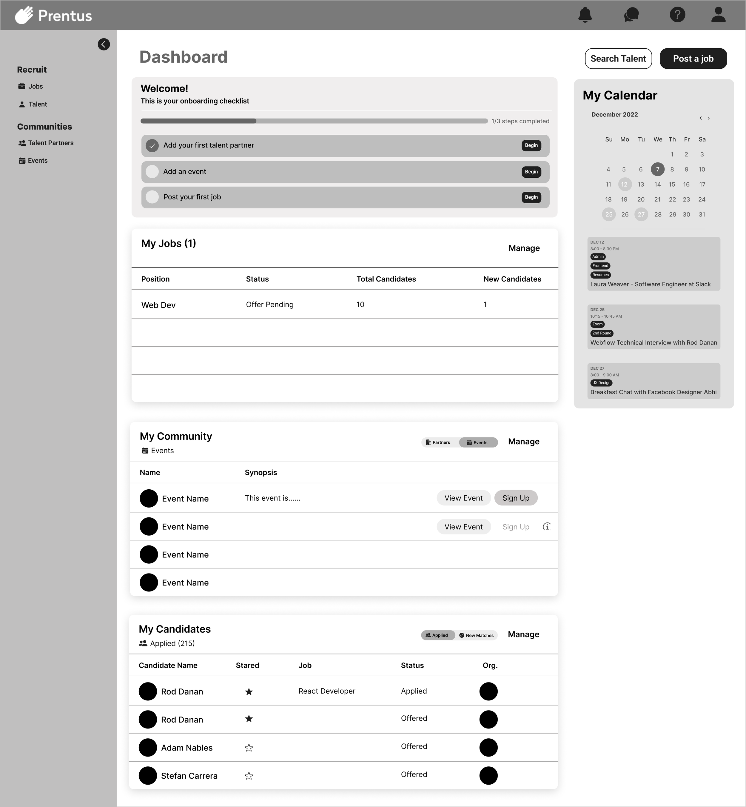
We identified the Prentus Employer Dashboard's three core functions: Posting a job, Partnering with talent sources, and connecting with individual candidates. We created three sections representative of those core features.
We re-imagined the top navigation as a sidebar to add clarity and visibility of system status. This allowed employers to see the Recruit and Talent Tabs subcategories, further illustrating these functions within the web application.
An “Events” tab was added to the “Community” section to distinguish between community-hosted events and calendar events, which we learned was a point of confusion in the previous design.
The calendar has been updated to show a monthly view in addition to an upcoming view.
Introduced consistency between language and navigation.
For example, “Community Partners” was changed to “Talent Partners” on the dashboard, and “Source” was updated to “Recruit Talent” on the side navigation.
Onboarding
In the Pre-existing product, new platform users were guided through an account creation flow; however, as previously stated, once they completed it, they were unsure of what to do next.
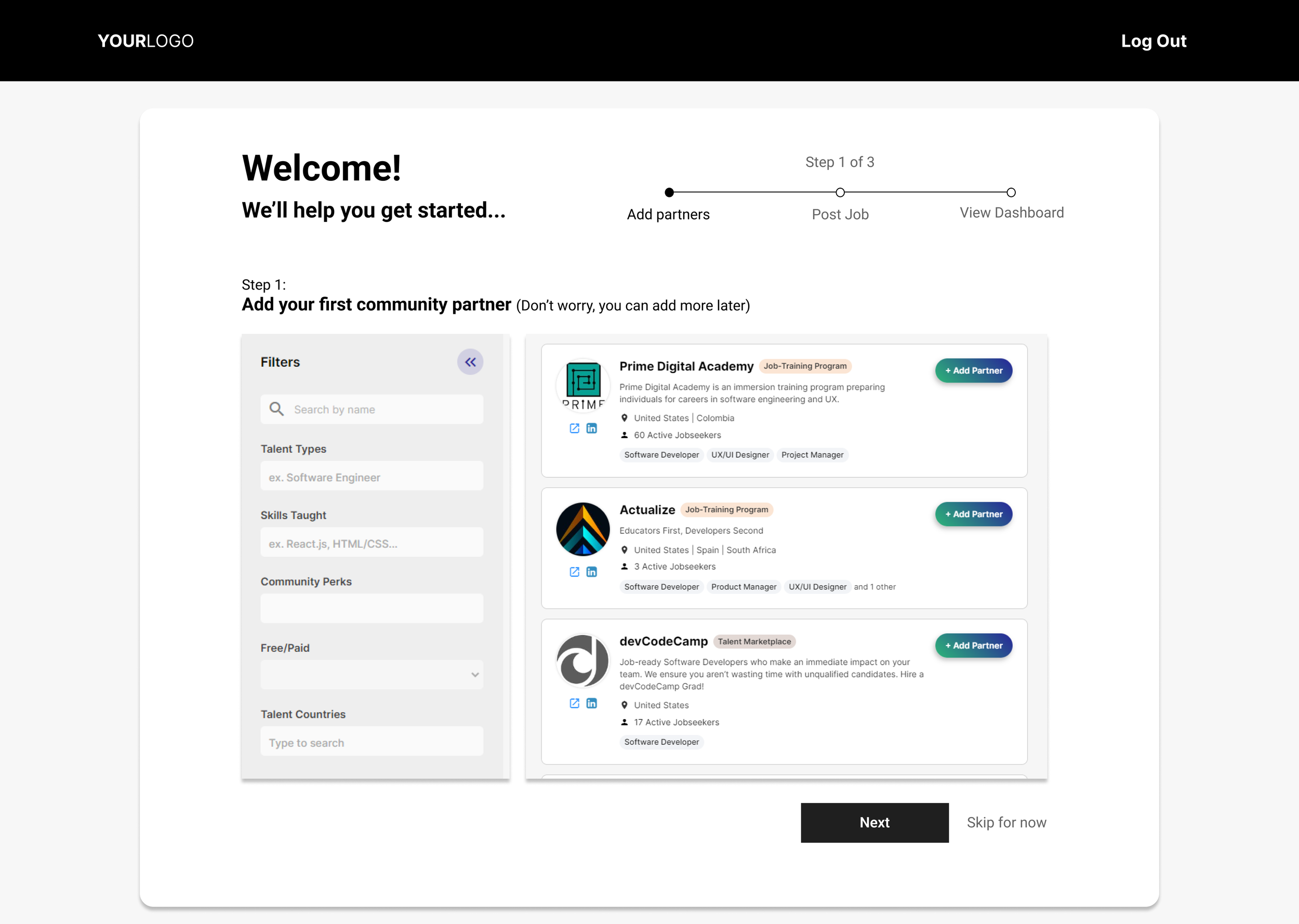
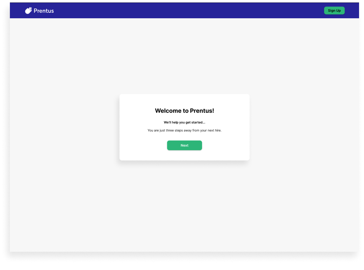
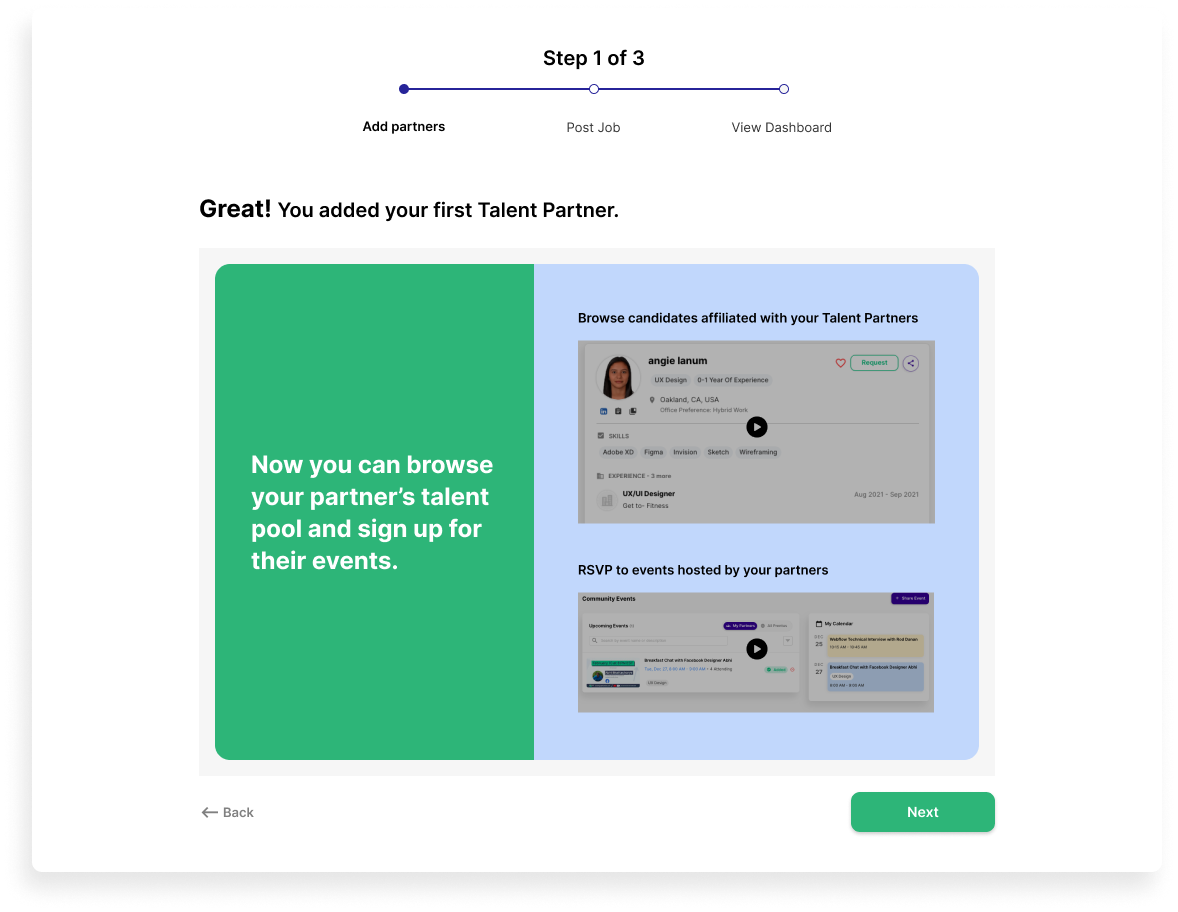
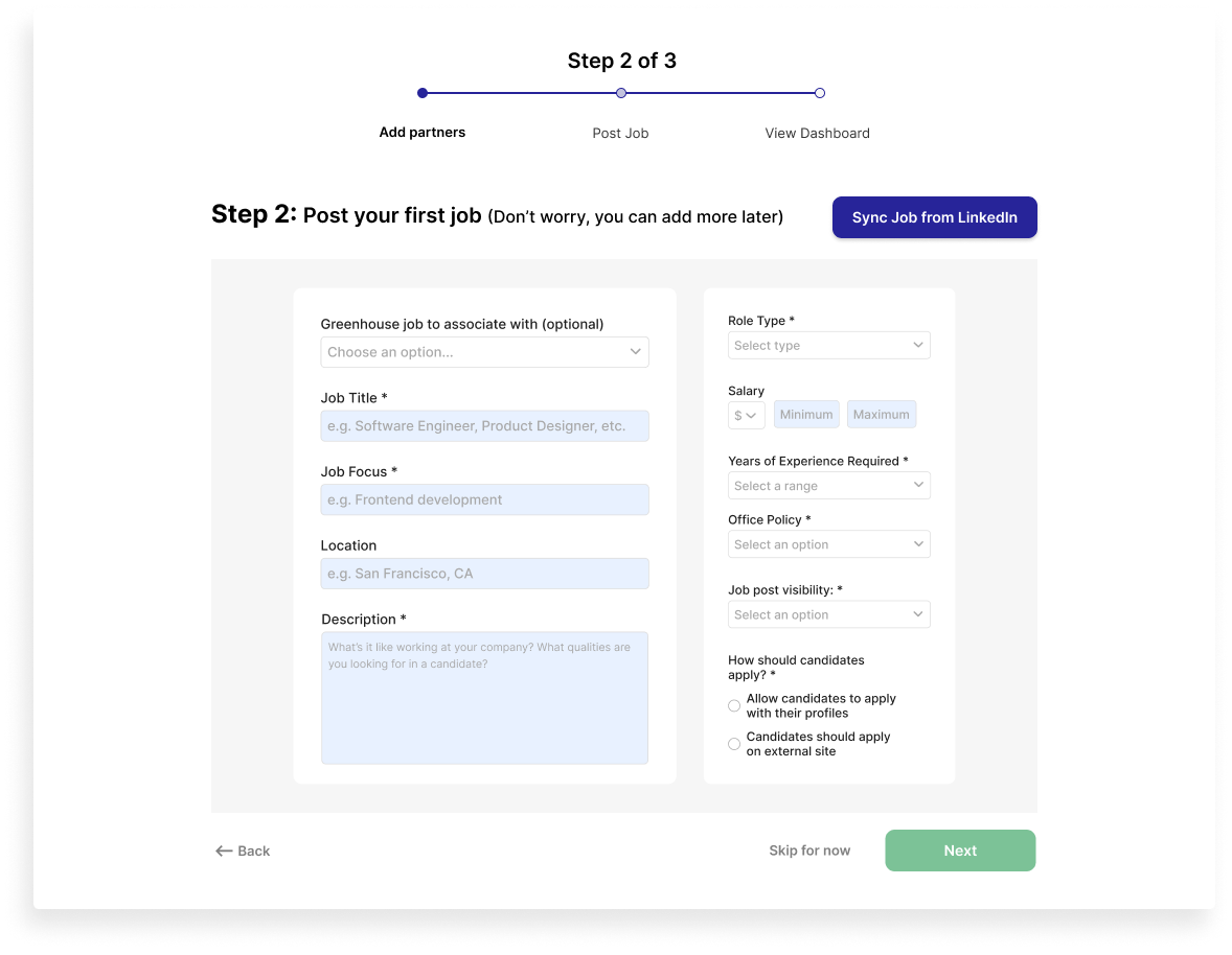
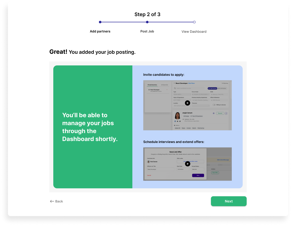
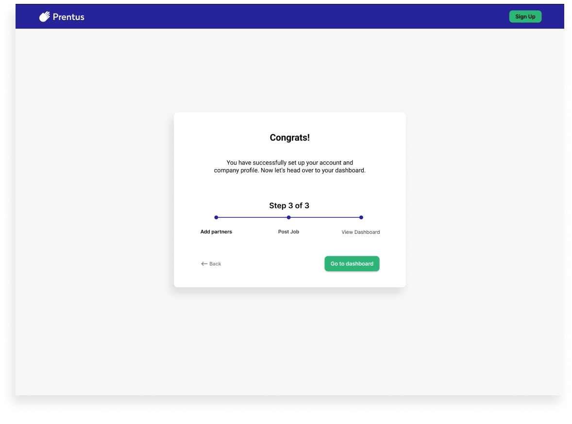
As part of our design solution, we introduced an onboarding walk-through to the experience.
Goals:
Create more clarity for new users about the purpose of Prentus and how it works.
Gradually introduce the website's functionality, and inform the user of what Prentus is for
Show users how they can benefit from the platform so that by the time they get to the dashboard, they clearly understand how to utilize it.
Strategy Benefits:
Users are introduced to the basics incrementally so as not to be overwhelming.
Users get invested in the product early on; by the time they are on the site, they will already be familiar with its functionality and have made choices customized to their needs.
Provides freedom and customization to the user, along with clear guidance, allowing the user to feel in control but also supported.
The progress bar keeps users informed while assuring them that onboarding will be quick and easy.
