UI Case study
CR Juices Health Bar & Cafe
Mobile Website & Desktop Redesign
OVERVIEW
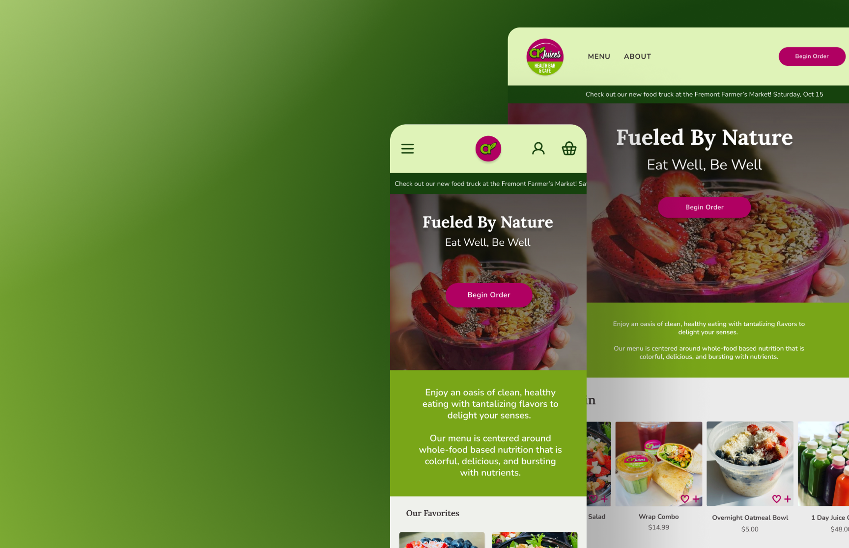
Mobile Website redesign for CR Juices, a juice bar and cafe in Fremont, OH. The main objective was to create a convenient mobile shopping experience so that users could more easily access CR Juices’ products on the go.
SCOPE
2 Weeks
TOOLS
Figma
Google Meet
Canva
TEAM
Grace Curley
Kim Dirmaier
Kirstin Nielsen
Neelu Mirkhani
MY ROLE
UI Designer

Research
We set out to answer the following questions:
Who are the competitors?
What features do competitors have on their websites?
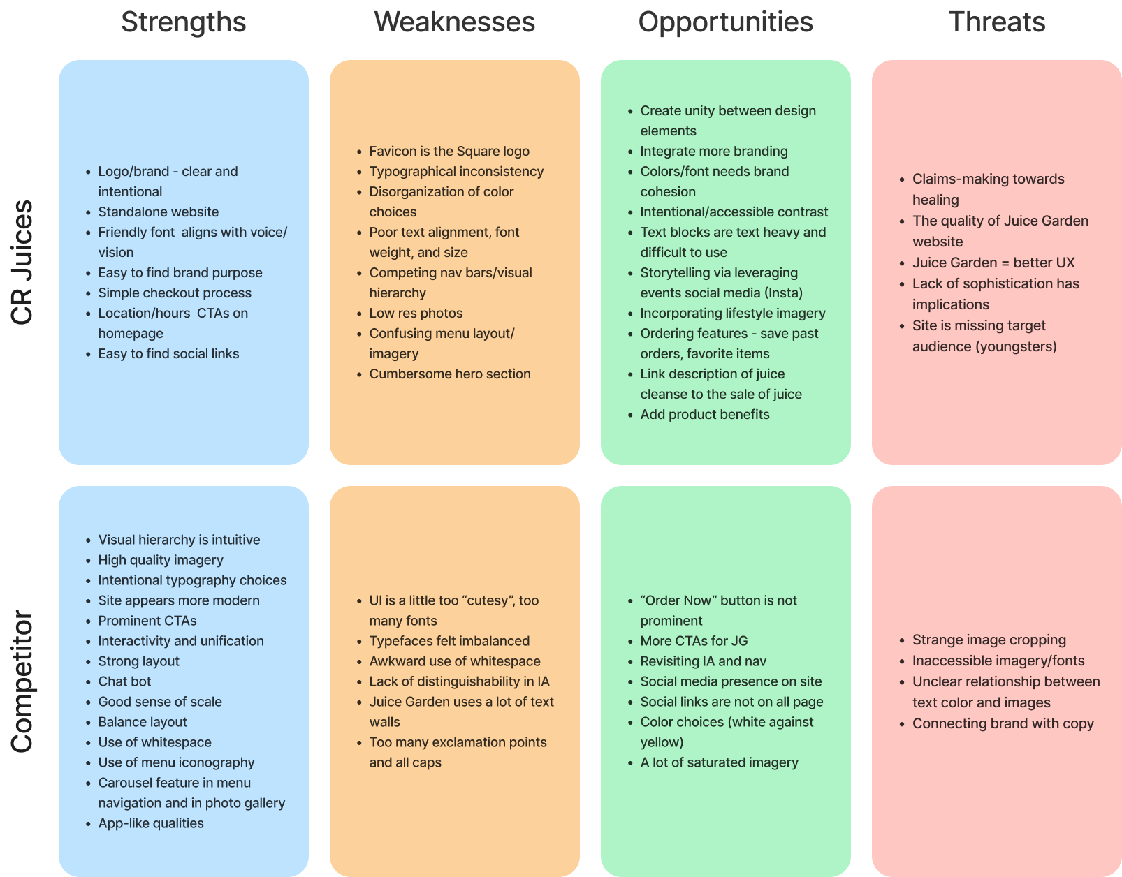
What are the opportunities for improvement on the current site?
The team utilized several research methods for this project, including stakeholder interviews, competitor analysis, and SWOT analysis, to gain insight into how we could improve the CR juices mobile website experience.
User Persona
With the insight we gained through our stakeholder interview, competitor analysis, and SWOT analysis, our team created a user persona to represent a typical user of the CR Juices website.
This persona allowed us to understand some of the goals and pain points that the end users experience when interacting with CR Juices.

Problem
CR Juices’ customers need a succinct, convenient, and interactive mobile ordering experience to support a healthy lifestyle.
Solution
Design a new mobile website experience that addresses key pain points:
Incorporating more imagery to create a more visual experience.
Allow users a way to interact with the brands' social media.
Include more information about menu items.
More visibility around the rewards program.
Design for mobile-first
Wireframes

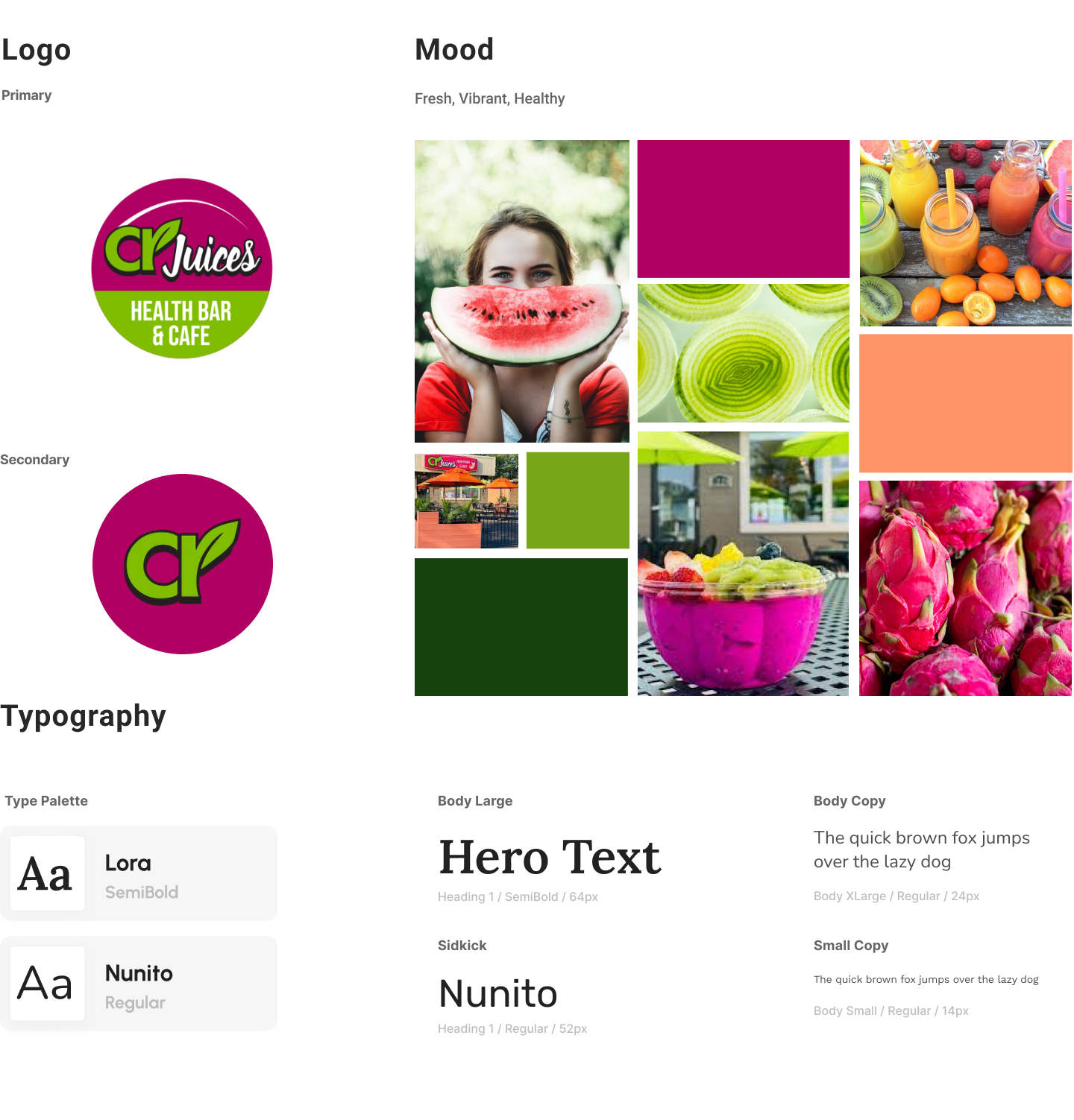
STYLE GUIDE
Final Design
Menu
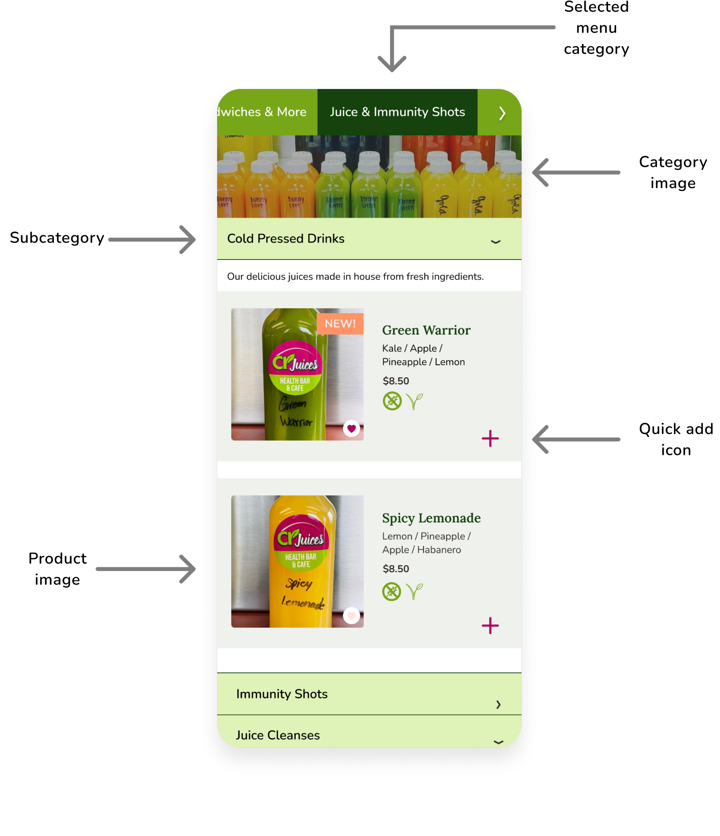
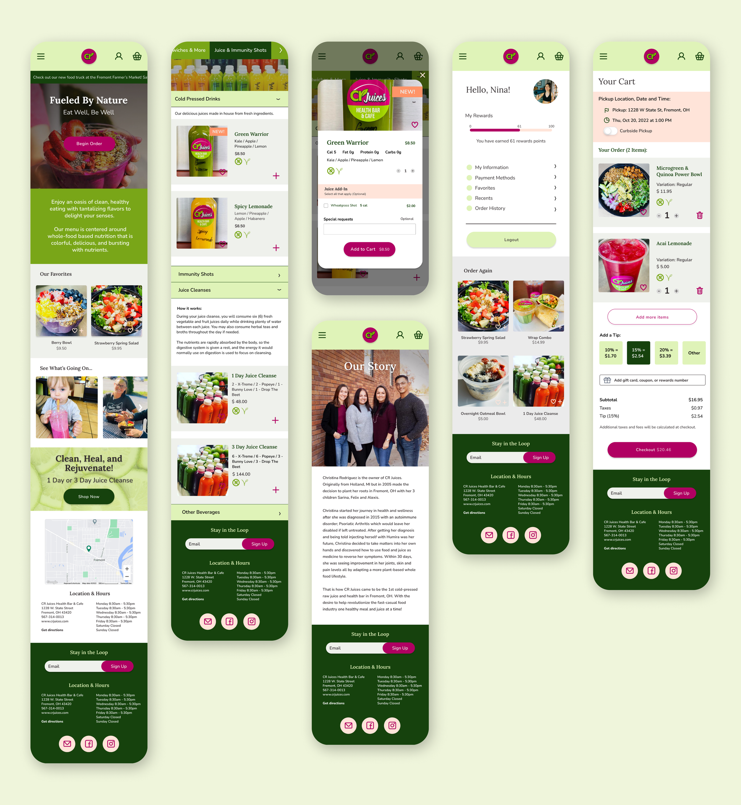
Allows users to see and browse menu items quickly. Users can scroll through the categories; The selected type is indicated with the darkest green.
The category header image acts as an additional visual indicator to orient the user.
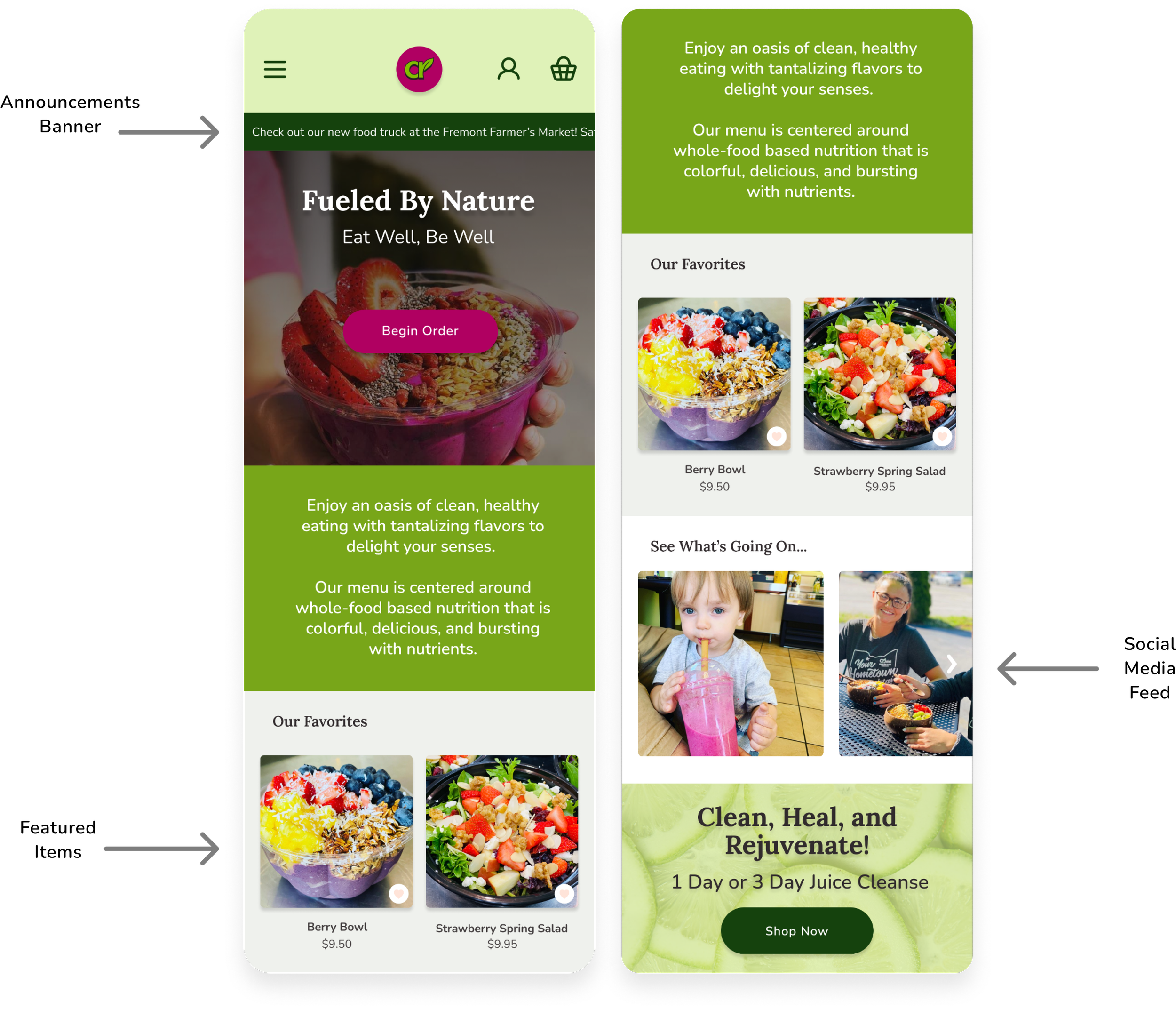
Home
Users can stay updated about discounts and the location of the food truck with the addition of the announcements banner at the top of the home page
Including a section for featured items help decrease the mental load required to make a decision when ordering.
Featuring the social media feed help connect user connect with the brand, something that our user persona values.
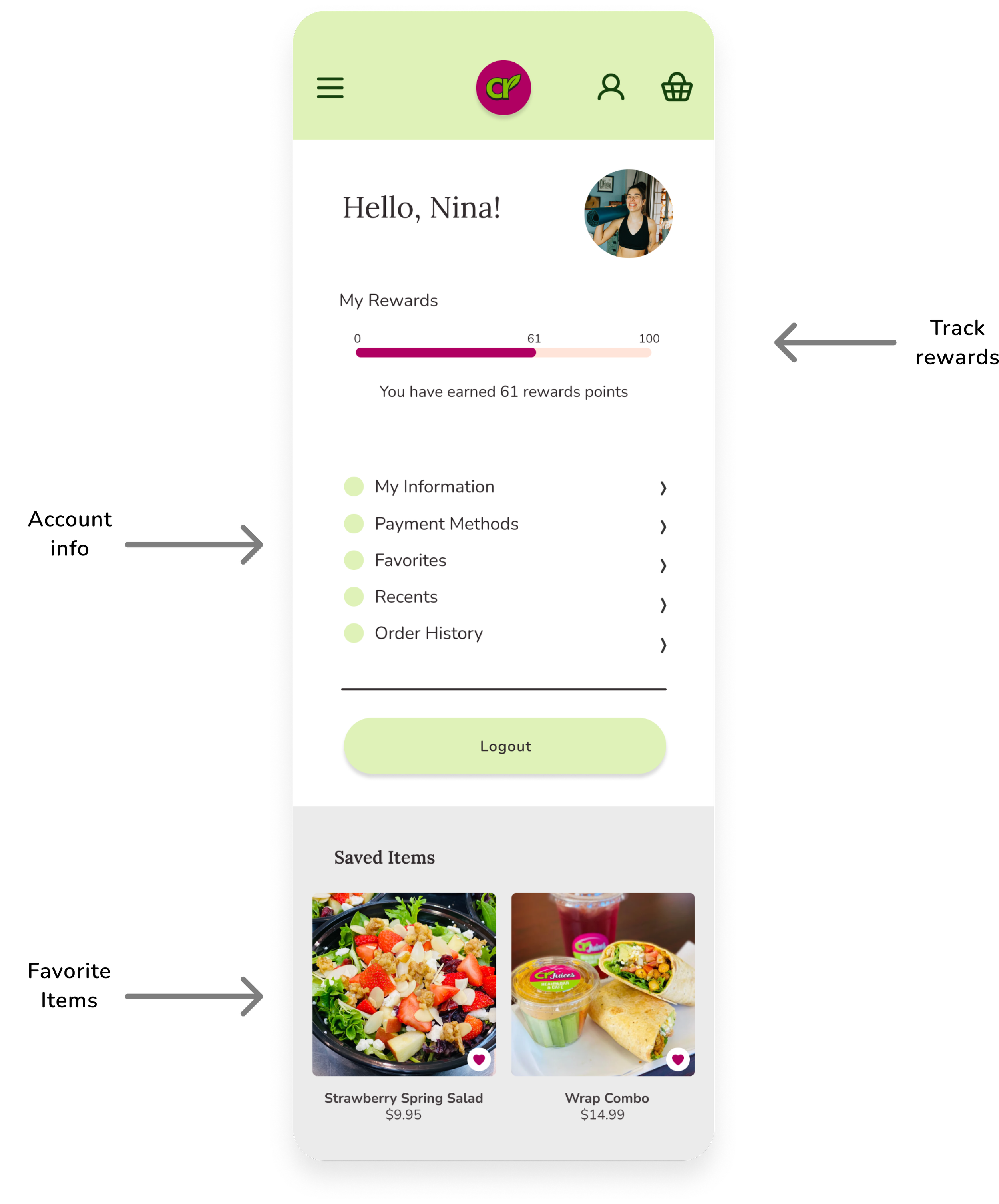
Profile
In the previous design, there was no way to interact with the rewards program. The addition of the profile page not only allows users to track points but also manage their account information, see order history, and view saved items
Item details
We learned in our research that transparency is essential to our user persona. With that in mind, we highlighted nutritional information and utilized dietary preference icons on menu item details screens.

Next steps
Because of time constraints, this project concluded with design mockups.
Given more time, the next step would include the following:
Prototyping
User testing
Iteration
Applying the visual language
to a desktop design
